Soora Skin
A ground-up redesign of a Korean skincare brand — repositioning, packaging system, and e-commerce website rebuilt as one calm product language
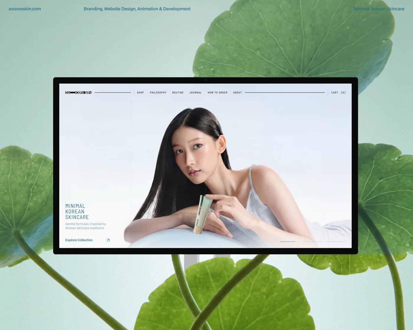
[ What I delivered ]
Repositioning, a new visual language, an updated packaging system, and a rebuilt e-commerce site — shipped as one coherent product
For Soora Skin, we updated the product from the ground up — redefined its positioning, redesigned the website and developed a new packaging system
- 01 Brand repositioning and visual language
- 02 E-commerce information architecture and catalog system
- 03 Packaging system across the full SKU range
- 04 Product page templates with a focused buying flow
- 05 Mobile-first responsive layouts across all touchpoints
- 06 Component library for ongoing iteration by the in-house team
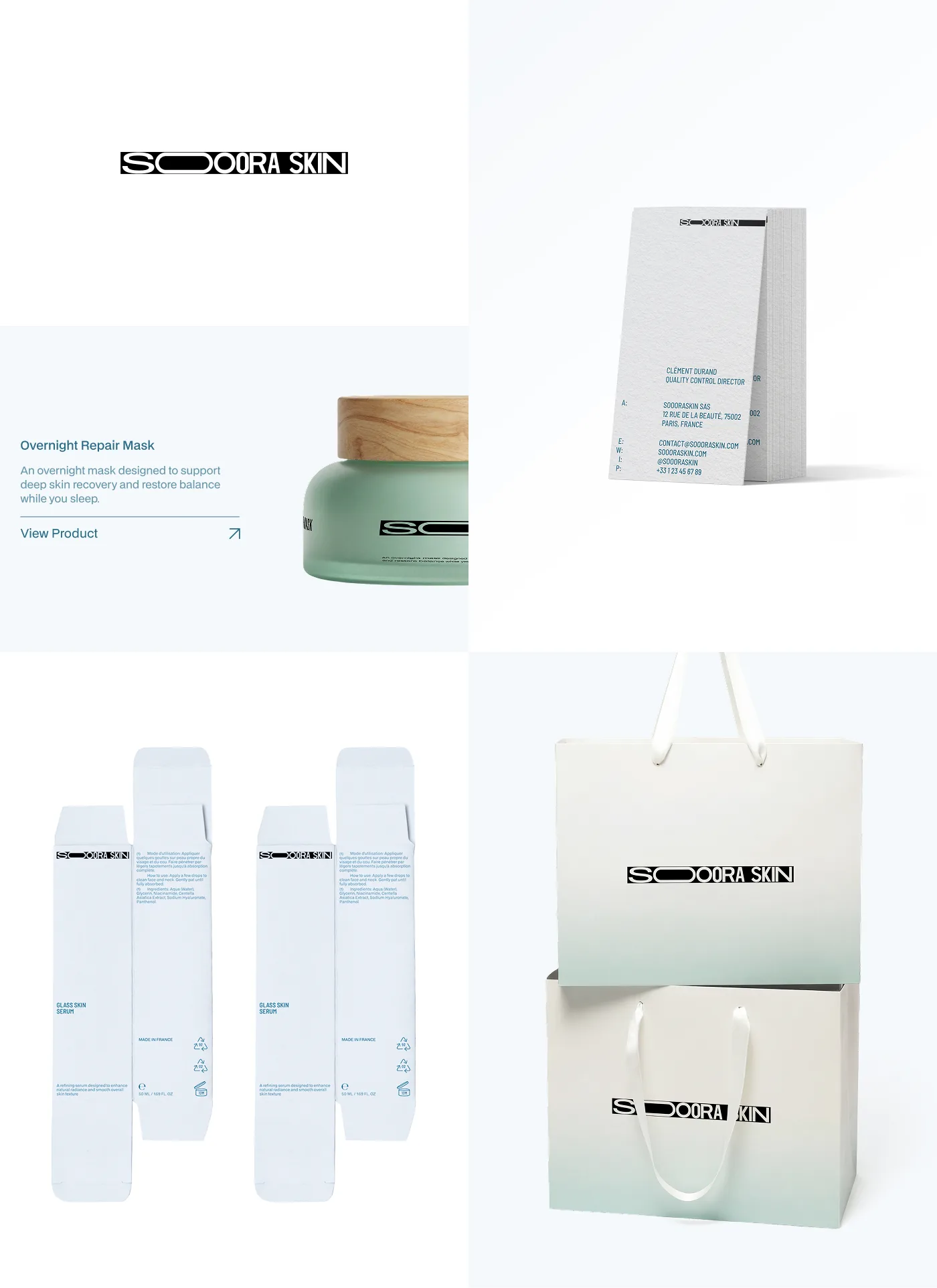
The goal was simple: remove noise and make the product easy to understand. We simplified the structure, rebuilt the catalog and reduced unnecessary steps so users can navigate faster and make decisions without overload
[ Direction ]
The interface works as an extension of the product — calm, direct and without distraction. The focus stays on the formula, its effect and how to use it
[ Identity ]
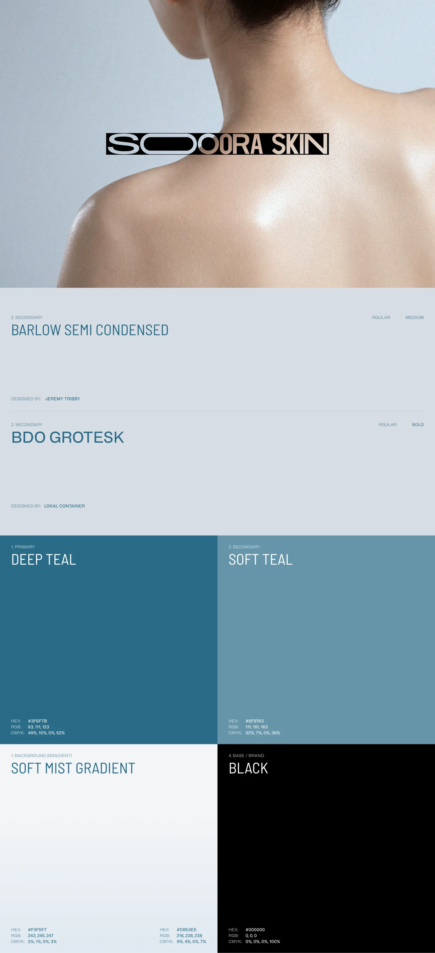
A pared-back identity built on two typefaces — Barlow Semi Condensed for structure, BDO Grotesk for product moments — paired with a restrained palette of deep teal, soft teal, mist gradient and pure black. The system stays quiet on the page so the product can speak
[ Catalog ]
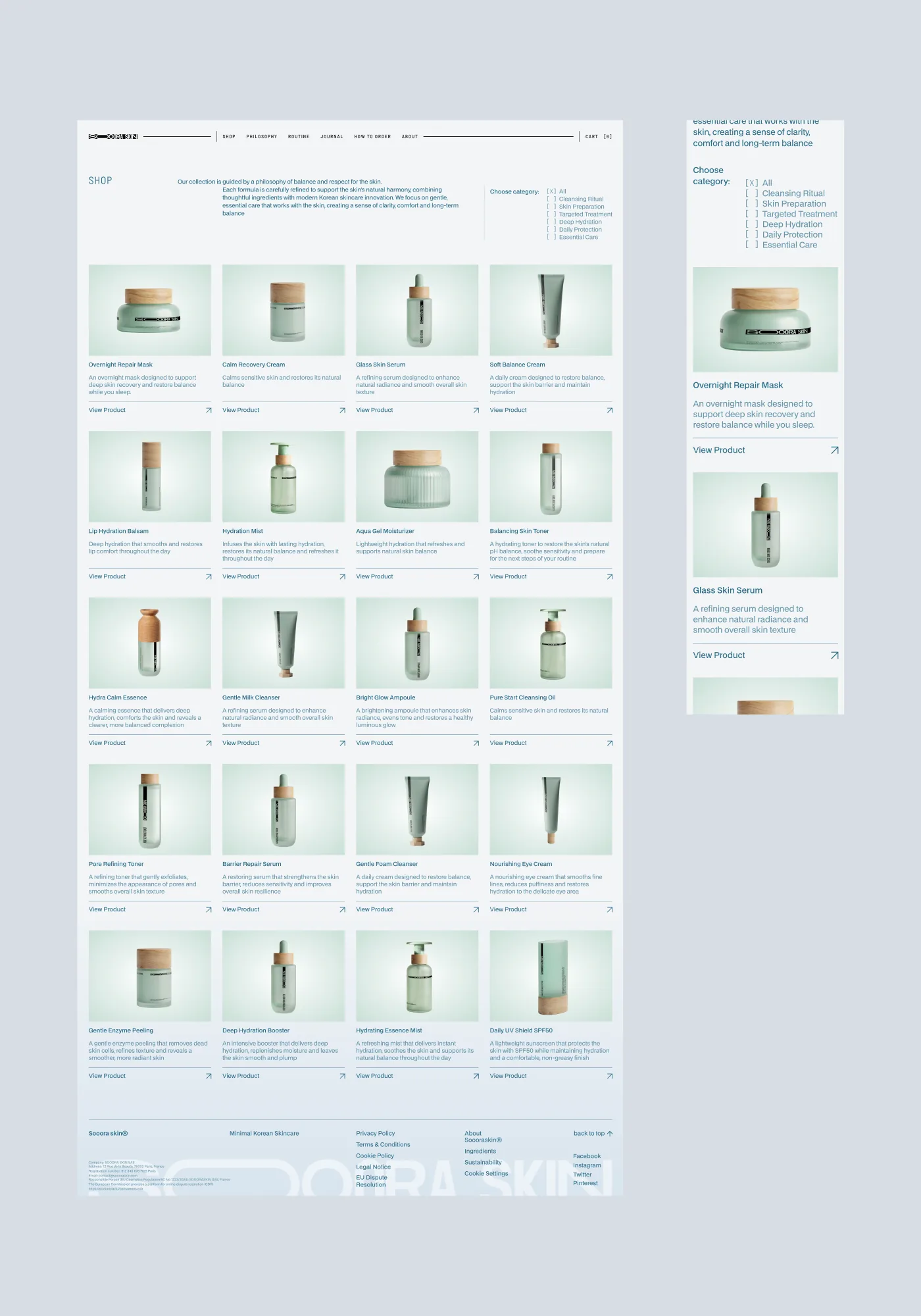
A consistent product grid replaced a fragmented catalog. Filters were narrowed to the categories that actually drive a purchase decision — concern, type, format — so the path from landing to product is short and predictable
[ Mobile ]
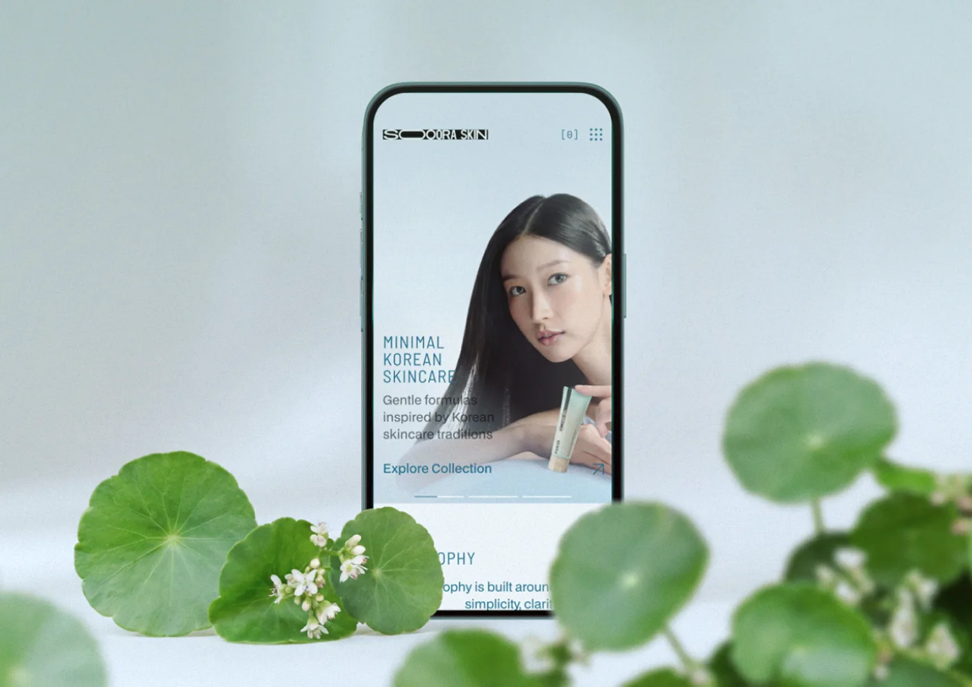
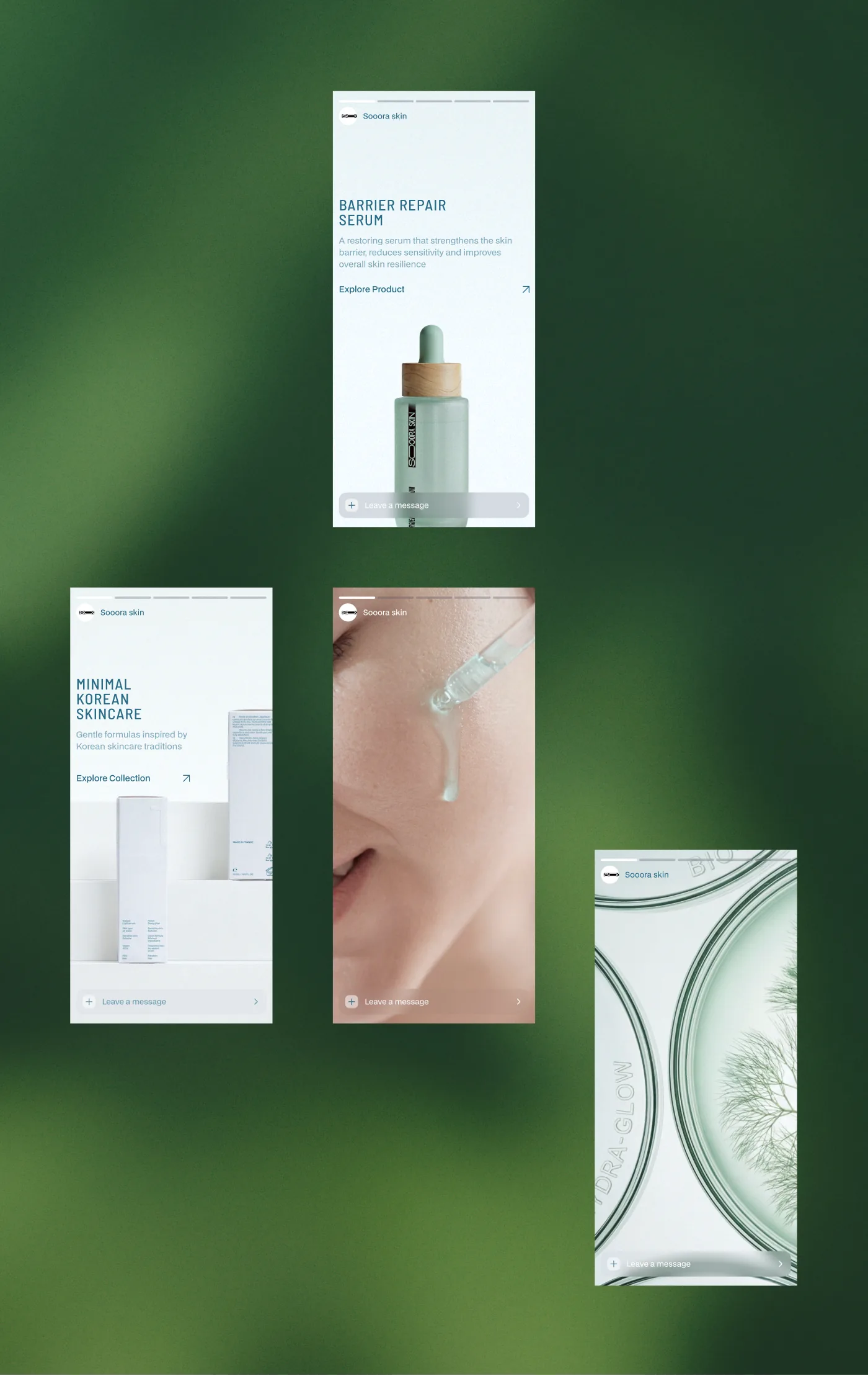
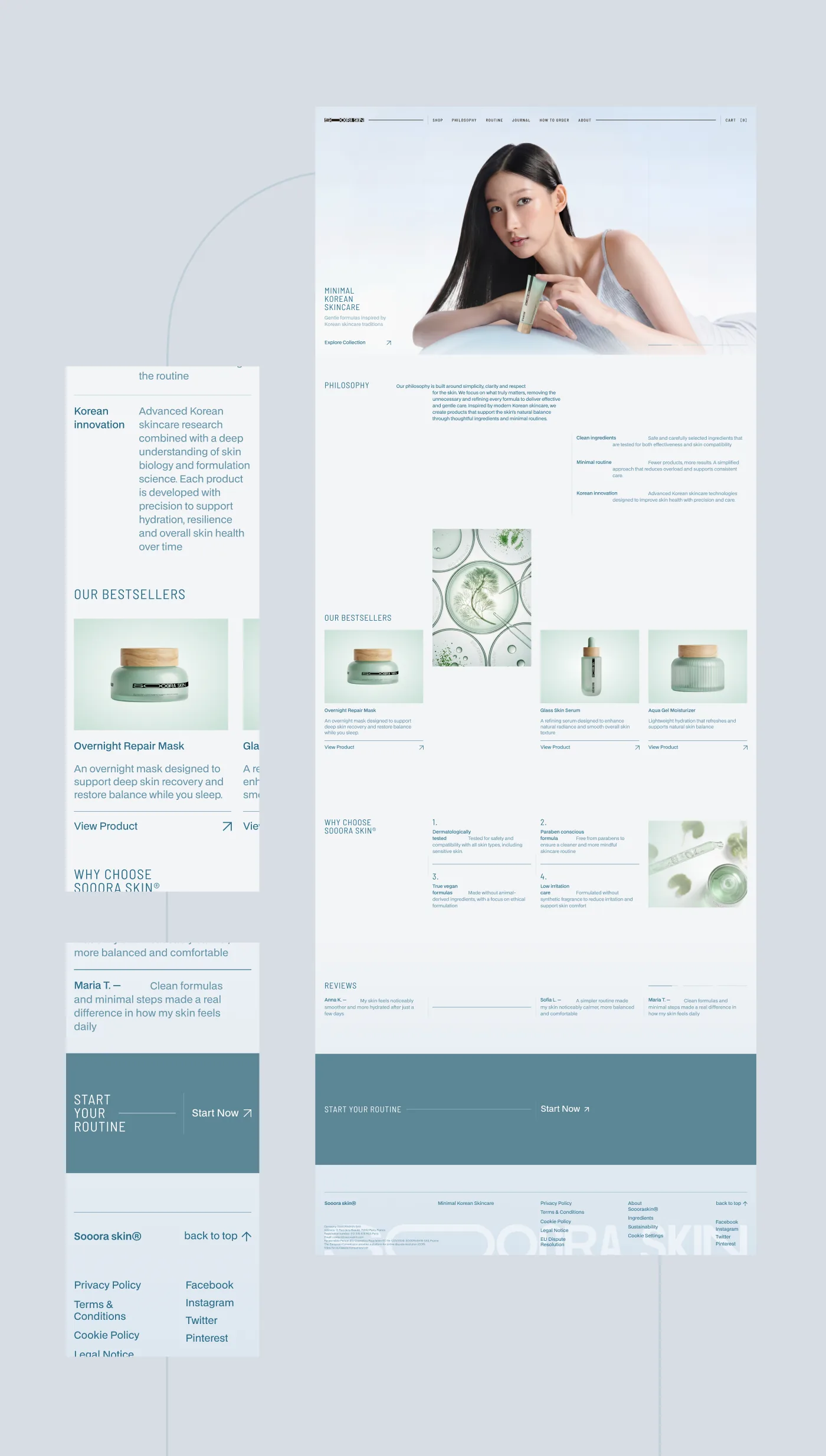
Mobile is the primary surface for skincare purchases. The mobile layouts keep the same hierarchy and density as desktop — no stripped-down phone version, just the same product language at thumb scale
[ Summary ]
Soora Skin was a full reset, not a refresh. The catalog, the packaging system and the brand were inconsistent with each other, and the e-commerce had grown into a structure that worked against the product. We took the system apart and rebuilt it around a single question: what does a user need to make a confident skincare purchase?
The new product language is restrained on purpose. Typography, layout, and color hold their own weight without decoration — every element exists because it changes how the product is understood, used or chosen. Routine, ingredient, formulation and SKU are the only objects on stage
Packaging, identity and the website were shipped together so the brand reads as one product across the shelf, the inbox and the phone — not a stack of disconnected touchpoints
[ Pipeline ]
[ Credentials ]
