SVRTW | Clothing e-commerce design and development

About the project
We took on the design of the store and its admin panel, the front-end build, responsive layouts, a code security review and SEO recommendations. For us this is a project where interface work carries on into implementation: from the character of the photography and the catalog structure to component states and data requirements.
We did the design, the front-end build and the storefront preparation; the back end is built by a third-party developer and the store is still in progress. So the illustrations show working prototypes with test data: product names, prices and photos are placeholders.

The new brand image in everyday shopping
On the home page, large campaign shots alternate with product selections. From a collection you can go to the pieces, and from a look to a specific category. The photography sets the mood and at the same time becomes a way into the range.
We kept the shots at different scales: wide frames show the look, close-ups let you see the fabric and the fit. The name and price still stay part of every card. We wanted to carry the character of the new identity into the interface a shopper uses every day.

Give the choice clear landmarks
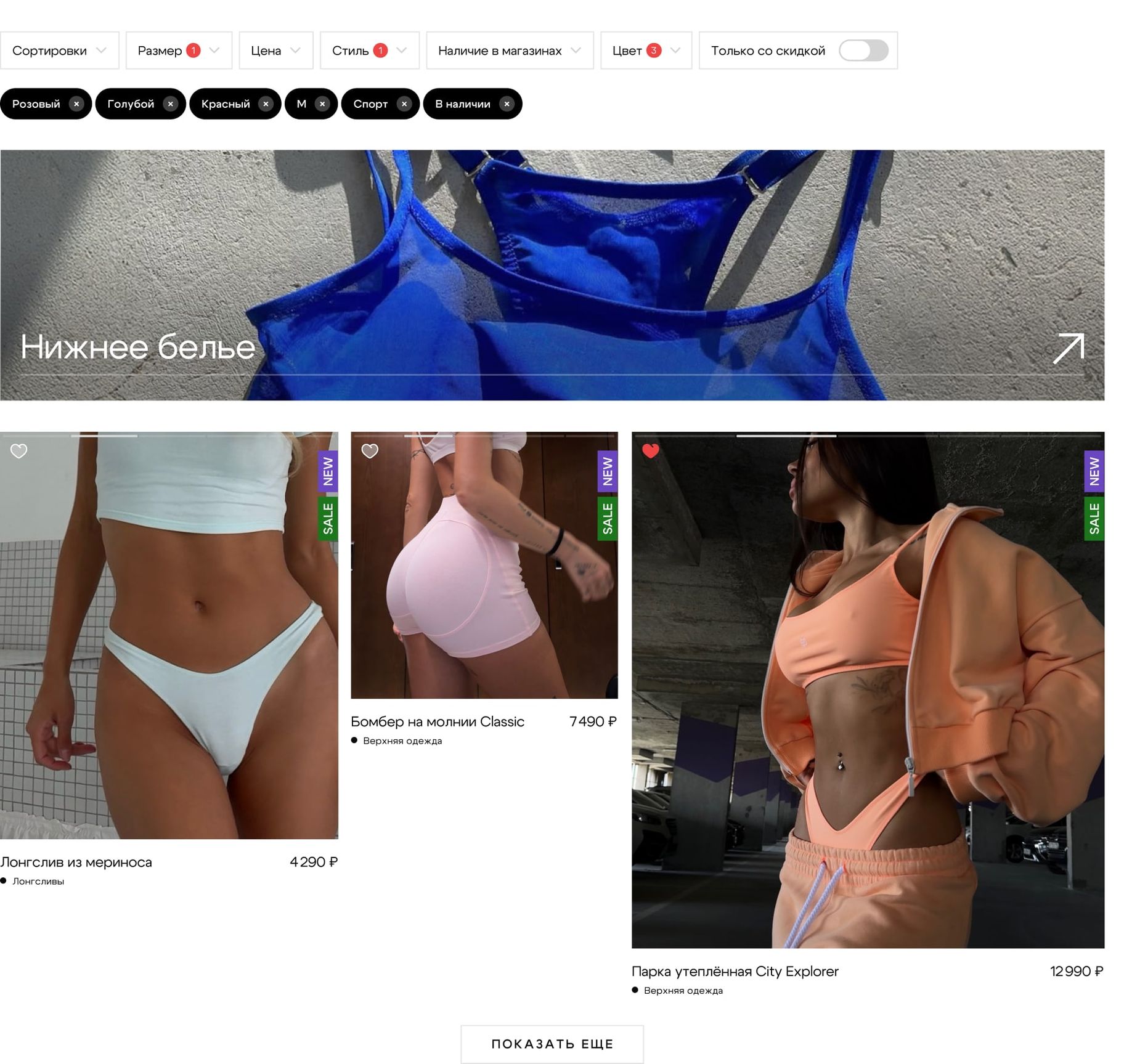
People come for clothes with different degrees of certainty. Some browse the new collection, others look for a piece in their size and colour. The catalog supports both: selections and photography help explore the range, filters narrow the choice down to specific requirements.
The chosen filters stay visible above the products. Size, colour, style, price, discount and in-store availability can be revised without going back to the start of the search. That way the catalog keeps the link between what a person asked for and what they see in the results.
Help people picture it on themselves
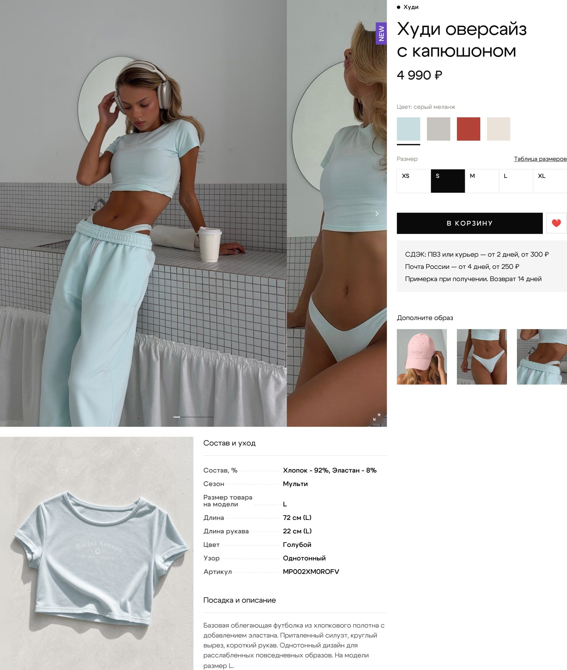
With clothing, one good shot is not enough to decide. On the product page we combined on-model photography with colour and size selection, a size chart, composition and fit details. A shopper needs both an impression of the piece and a way to check whether it will suit them.
Delivery, try-on and returns sit right next to the buy button: these terms take part in the decision before anything goes into the cart. The “Complete the look” selection continues the choice through combinations, keeping the context of what the person is already looking at.
Keep it clear to the last step
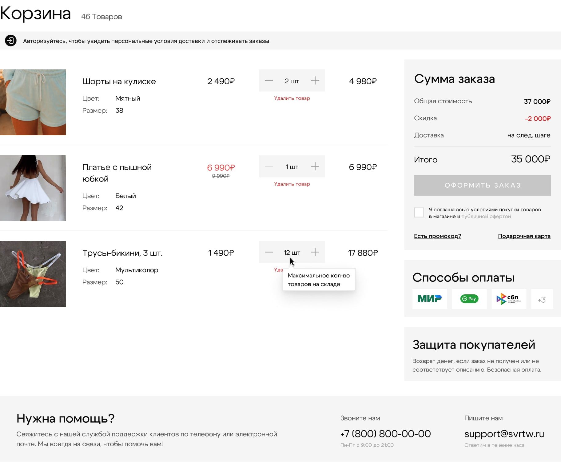
In the cart, the chosen piece stays a specific variant with its colour, size and quantity. Price, discount and order total are visible alongside. The promo code and the gift card have their own states, errors and limits included.
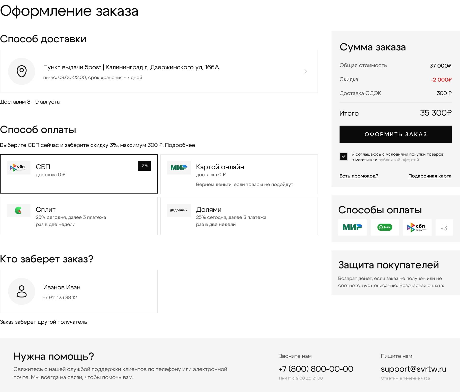
Checkout continues the same logic: delivery method, recipient and payment are gathered next to the total. We worked through the selection and confirmation screens so the interface reveals the purchase terms step by step and shows what is still left to fill in.
Design and front end
Our work covered the design, the front-end build and the responsive layouts of the store. Shared components tie together the catalog, the product page, the cart and the service pages. On phones we worked separately on the menu and a sticky buy bar: price and action stay within reach while scrolling a long product page.
The storefront code also went through a security review. We looked at dependencies, markup handling and security headers, and wrote recommendations for the next stages of integration. For the back end we set down requirements for authentication, payment confirmation and protection against replayed requests. That lets development continue with a clear split of responsibility.
Tie search to the actual range
We prepared SEO recommendations for the categories, product pages and technical markup. At the centre of this work is product data: name, variant, price, availability and images. They have to be used consistently on the page, in structured data and in product feeds.
Separately we covered indexing of service and filter pages, canonical URLs, breadcrumbs and contact details. The recommendations are split into stages: what can be prepared in the storefront now, and what needs the real range and a connected back end. That way SEO becomes part of how the store is built while it is still being built.
An admin panel for the store team
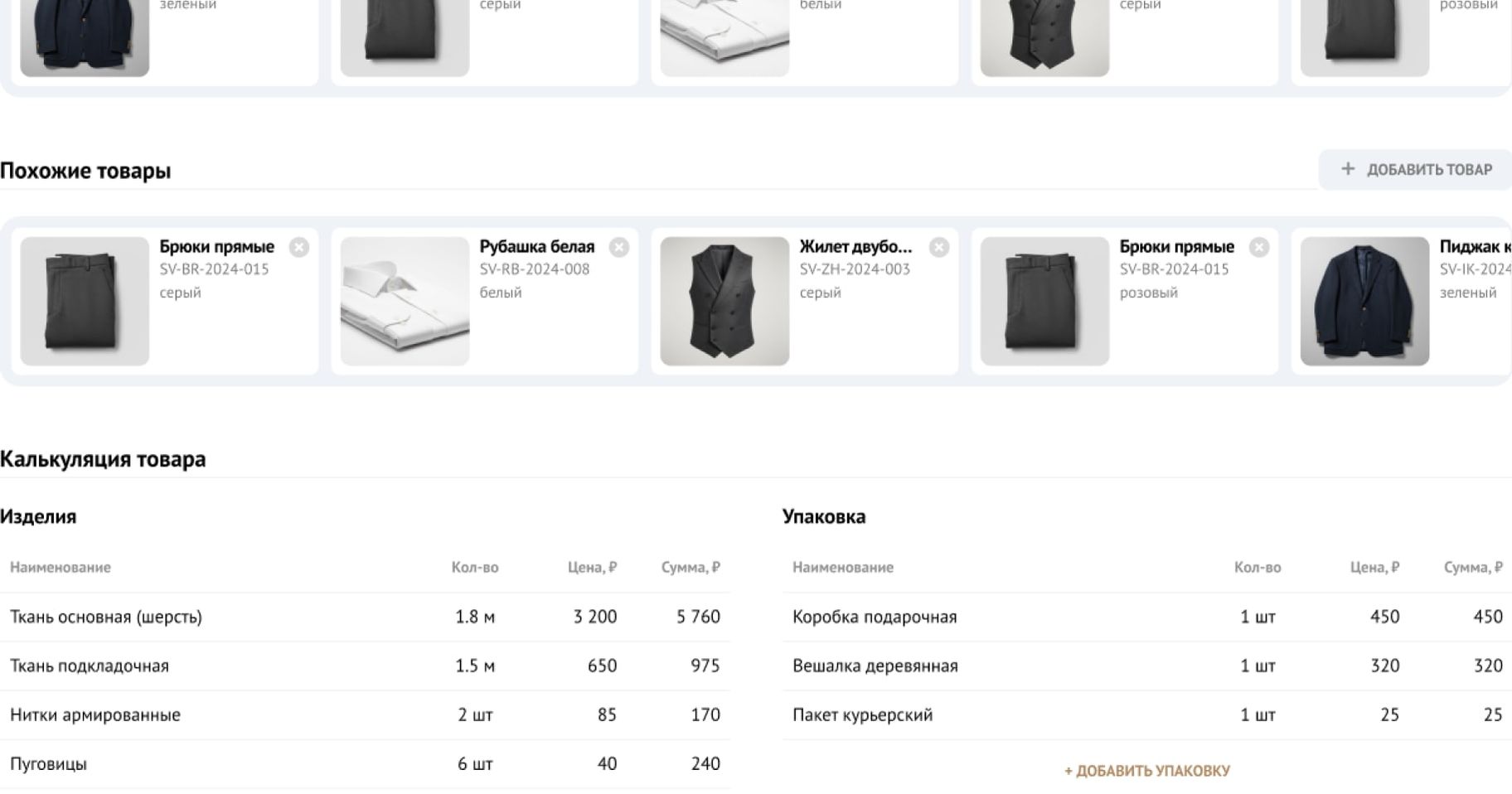
Alongside the storefront we designed the admin panel. It covers sourcing materials and managing the range, orders, analytics, customer communication and accounting. Staff work under user roles.
This part connects the shopper’s interface with the team’s daily work. Behind every choice on the site are product data and operational processes, so for us designing a store means designing both sides. We show one screen here; the rest stay inside the project.
Why we love this project
Here we got to carry the brand work on into the product itself. The character of the photography survived in the store, and behind an expressive storefront there are now well-thought-out purchase flows and an interface for the team. We especially value that we could take decisions all the way from design to code and work out what the store will need next.
- Client
- SVRTW
- Role
- Product Designer, Full-Stack Builder
- Deliverables
- Online store design, Admin panel design, Front-end build and responsive layouts, Code security review, SEO recommendations, Rebrand by Openmint