You can stage a great first encounter with an app. The following morning is harder to stage. Someone opens it with a job to do, finds the action they need, or goes back to calling their account manager.
That's where B2B app design gets tested for me. The user already knows what they want to accomplish. The product needs to help them do it without introducing itself all over again.
One app, several working days
Premier Ice defined guest, customer, sales representative, and driver roles. It's a published case study showing different workflows within one product. Customers need to place orders. Sales reps also work with customer locations and equipment. Drivers have their own responsibilities.
Giving everyone the same home screen may look like a consistent design decision. But if people keep navigating past other roles' actions to reach their own, that consistency has a cost.
The person buying the product may not perform its daily operations, either. A manager wants visibility and control; an employee wants to finish a task. We need to understand how those interests connect. In a small company, one person may do both, so I wouldn't impose a ready-made “buyer versus user” model on every project.
Reorder doesn't mean copy and forget
Premier Ice includes quick lists and reordering. Someone with a clear intention doesn't need to browse the whole catalog again.
Reordering comes with an inconvenient detail: the world has changed. An item is unavailable, terms are different, a quantity needs adjusting. The interface needs to show what carried over and what requires a decision now.
That's where the work goes beyond a Reorder button. If the system silently fills in unsuitable values, fast initial actions just move the problem downstream. I'd evaluate the time and clarity of the whole task, including corrections and confirmation.
A short path is useful while people understand where it took them. Click count alone won't establish that.
Permissions can't be added at the end
Connect roles to data and actions before detailed UI design. Who can view a record, who can change it, who approves an exception? What happens if permissions change while someone is working?
Postpone those questions, and the first screens tend to assume access to everything. Then the design has to accommodate real restrictions. Eventually, the action at the center of a flow may turn out to be unavailable to most users.
Also, hiding a button doesn't protect data. Access control must be enforced on the server. The interface explains capabilities and restrictions; it doesn't replace their implementation. The designer and specialist engineers need to agree on system behavior.
If different roles have become tangled in one customer portal, send it over for a review. We'll start with who does which work and where they have to work around the interface
What could be tested before detailed UI
The clickable Premier Ice prototype was tested with five foodservice clients. Defining roles and flows made it possible to test decisions before producing the detailed UI and UI kit.
Five clients can't speak for drivers and sales reps. I'd focus on whether participants match the task: do they do this work, which conditions do they understand, and how do they differ from other users?
Watching an action is more useful than collecting approval. Someone may say everything is clear, then fail to find the operation they need. Or complete the task in an unexpected way. Either gives the team something to work with.
A prototype can test the sequence of a complex flow. Dependencies on real inventory, permissions, and connectivity need testing in a working system later. The prototype shouldn't be presented as evidence for things it doesn't implement.
What the results show and what they don't
The published case study reports a 28% increase in repeat orders through the app during the first six months. It also says the online share of revenue grew to 38% following the app's launch.
Those measures interest me more than installs because they're closer to the work the product exists to support. Precision still matters: 38% refers to revenue, not users or orders.
The public case study doesn't disclose the full measurement method or a controlled experiment. I can't honestly attribute all the growth to the interface alone, much less promise another company the same result.
For a new project, define repeat use, the comparison period, and other changes happening at the same time before launch. Otherwise, it's easy to end up with an attractive percentage and too many unanswered questions.
Mobile makes the working context harder to ignore
Mobile interface design depends on where people use the product. Are they standing by a shelf, moving between locations, or sitting at a desk? Can they review what they've entered? What happens if the connection drops?
Not every product needs full offline support. But if an action is saved on the device and sent later, those states must look different. “Saved” shouldn't imply that the company has already accepted an order.
Information density depends on the job, too. Sometimes people really do need the SKU, unit, stock level, and quantity together. Removing them to create whitespace is easy. Restoring the ability to make a decision can be harder.
Where I come in
The same approach applies to customer portals, enterprise software, and SaaS products: understand the work, roles, and constraints, then build the interface. That doesn't mean importing every enterprise feature into a small product. Each needs a user and a reason to exist.
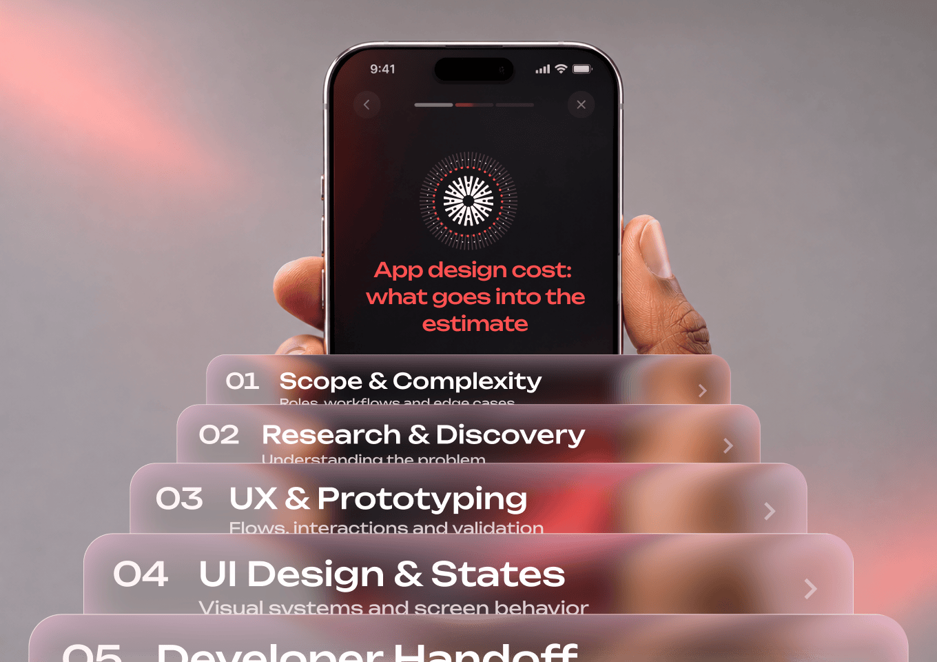
I connect user flows, prototypes, and detailed design. Server-side permissions, sensitive data, and complex business logic need a specialist team. I cover scope separately in app design cost. For finding problems in an existing product, start with a UX audit.
Send me a link and describe a typical user task. We'll look at where the product interrupts the work and what to test first
Sources and limitations
The published Premier Ice case study was reviewed in its Russian-language version on November 4, 2026: roles, quick lists, reordering, prototype testing, and reported outcomes. The 28% figure refers to repeat orders through the app in its first six months; 38% refers to online revenue share. Offline support and additional permissions questions are design considerations, not claims about features implemented in this app.